Delft Dashboard.

Discover Reactive Data.

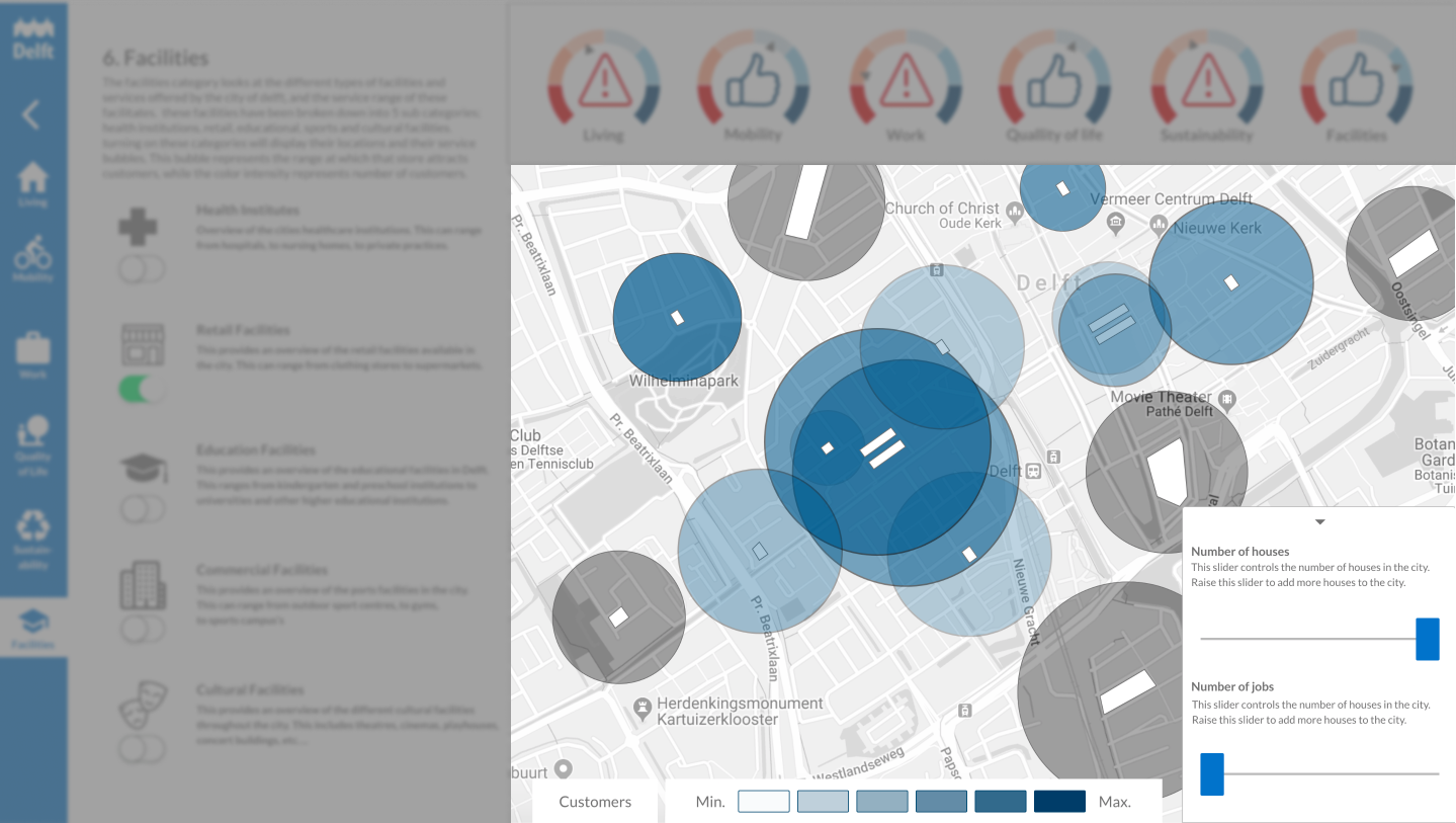
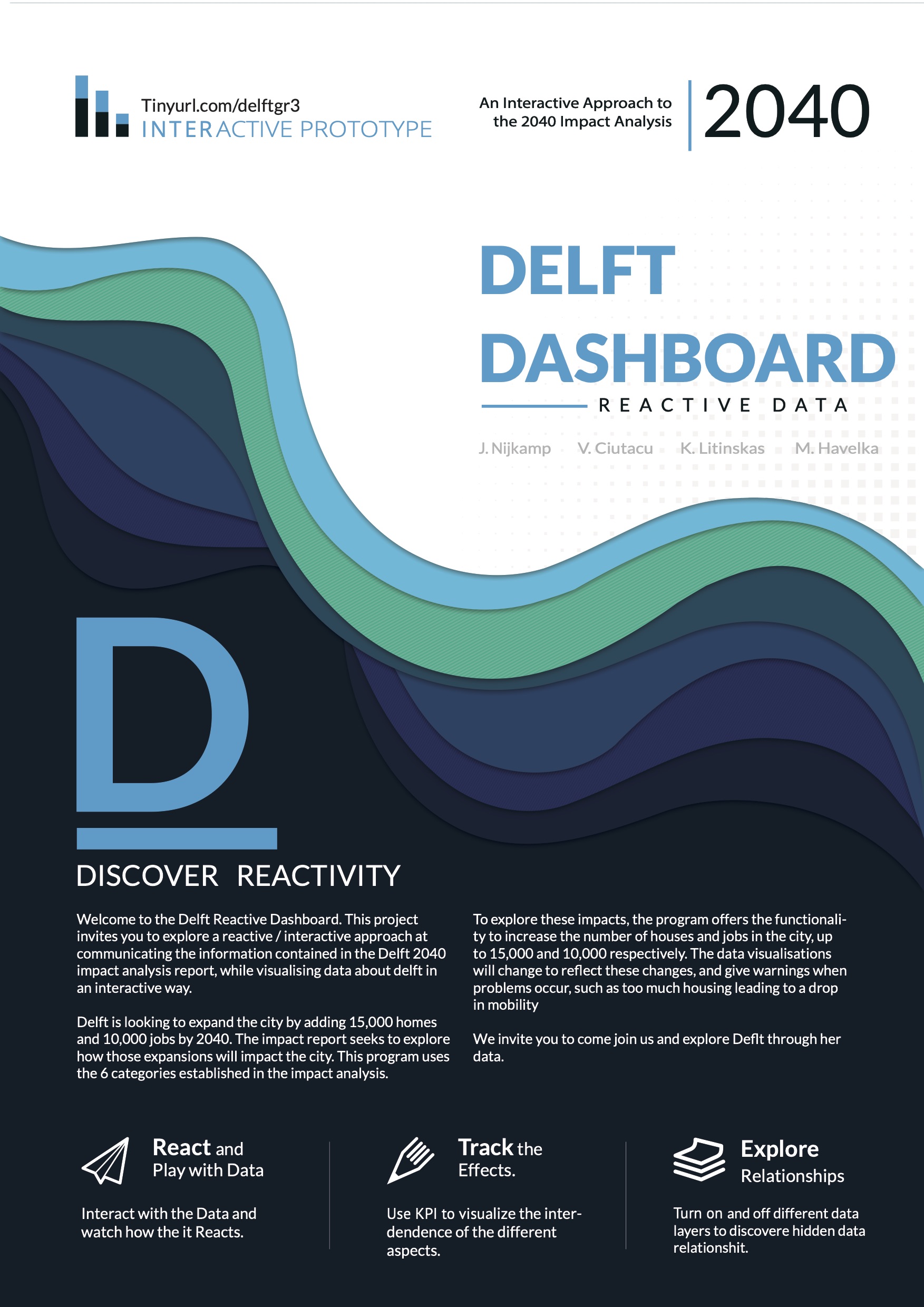
The Delft Reactive Dashboard invites the users to explore a reactive/interactive approach at communicating the information of the 2040 Delft impact analysis report, while visualizing data about Delft in an interactive way. Delft is looking to expand the city by adding 15,000 homes and 10,00 jobs by 2040. To explore and understand the impact this will have on the city of Delft; the Delft Dashboard has the functionality to add extra home and jobs up to 15,00 and 10,000 respectively. The data visualization will change to reflect these changes, and even give warning when problems occur, such as too much housing leading to a drop in mobility.

The Client.

Whose Problem Needs Solving? 

Summary.

Overview of the Project

Under Non-Disclosure Agreement

Some of the details in this case study may be vague to protect the client's intellectual property.

This project was developed around the central concept that data could and should be more than just static information on a page. Making data not only interactive but reactive to the changes the user makes elsewhere shows the complex nature of data and how it can be linked to so many other factors. Furthermore, given the complex and jargon filled nature of the 2040 impact analysis report: we wanted the dashboard to be easy to use for everybody not just those with a technical background. And lastly its important to the nature of the project that the dashboard effectively communicates the information it needs to.

Services.

  • Design Strategy.
  • Web Application Design.
  • Prototyping.
  • User Research.

Deliverables.

  • Interactive High Fidelity Prototype.
  • Interactive Coded Proof of Concept Prototype
  • In Depth Research/Scrum report.
  • Implementation Report
  • Project Poster


Outcomes.

  • A comprehensive and in-depth SCRUM report detailing the important insights into the project; and a report on the scrum process of the project.
  • A new narrative on data driven decisions in the context of urban and city planning
  • The city of Delft is moving forward with third parties to develop and build our project in a virtual 3d model of the city.
  • A deeper understanding of how to make ambitious data more relevant to the individual reader


Design Challenges.

What unique challenges did this project present?

The Year 2040

The city of Delft wants to build 15,000 homes and create 10,000 jobs in the city over the course of the next 20 years. This is an ambitious challenge that will change the face and often the very nature of the city. This will affect the cities traffic: its work location distribution: its levels of housing: the accessibility of parks: the number of supermarkets, and more. Understanding this impact is a lot of work.

Impact Analysis

The Impact Analysis Report for Delft 2040 takes all of the things that the city needs to consider when attempting to build these 15,000 homes and 10,00 jobs, and presents them in over 100 pages of technical jargon and complex diagrams and paragraphs. While this is fine for the city officials who are at home in this field: it has proven to be difficult to access for the other members of the city officials, not to mention for the residents of Delft.

Transparency

The city wants to be more open and more transparent in its policies and changes and wants to make it easier for the inhabitants of the city to understand and see proposed changes and access important information as it relates to them, however the current system that the city has in place for this does not suit their needs.


The Research.

What Key Insights Were Discovered During the Research Phase?

Making Data Tell a Story.

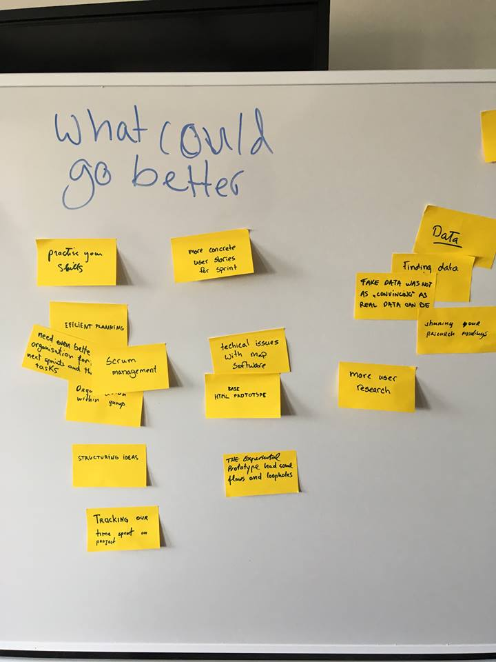
Static reports of over 100's of pages are a difficult and often boring way to present data, information and insights. Making these things interactive helps to improve levels of understanding and the size of the audience that can interpret the information. Furthermore making the data more personal (i.e. placing it within a personal scope) makes it much easier for people to relate with and understand the importance of the data. During this project these insights were translated into the concept of enabling city officials to interact with their virtual city and immediately see the results of their actions, not only making it easier to understand the impact: but a lot easier to communicate this impact to other parties.

Using Maps.

Maps entice readers to explore your data story and develop a stronger sense of place. But good maps require careful thought about how to clearly communicate spatial concepts with your audience. An effective map should show interesting geospatial patterns and should be easy to read in both black-and-white (as is often the case with printed materials) and color.

Use Color Effectively.

Colors for data's sake, not aesthetics. The use of color to represent a particular concept or idea is important. The use of color can help to make data visualizations stand out or can make it almost impossible to understand. During this project it was discovered through testing that when working with data visualizations its best to use color to signify something, and the intensity of that color to represent the intensity of that something.

Data Validity.

In the early stages of a data visualization project, its important to start with two interrelated issues: Where can I find reliable data?, and after you find something, What does this data truly represent? If you leap too quickly into constructing charts and maps without thinking deeply about these dual issues, you run the risk of creating meaningless, or perhaps worse, misleading visualizations. For this project it was important to keep asking these questions. One way we did this was by meeting on a weekly basis with the client to make sure we were on track with our assumptions and conclusions.


Design Vision.

This project was developed around the central concept that data could and should be more than just static information on a page. Making data not only interactive but reactive to the changes the user makes elsewhere shows the complex nature of data and how it can be linked to so many other factors. Furthermore, given the complex and jargon filled nature of the 2040 impact analysis report: we wanted the dashboard to be easy to use for everybody not just those with a technical background. And lastly its important to the nature of the project that the dashboard effectively communicates the information it needs to.

Insight Based Features

The following four features exemplify the four key insights mentioned in the research section. While not being anywhere near all the features and concepts designed: these 4 features give an astute look at how the insights were used to achieve the aforementioned design vision.

Limit confusion.

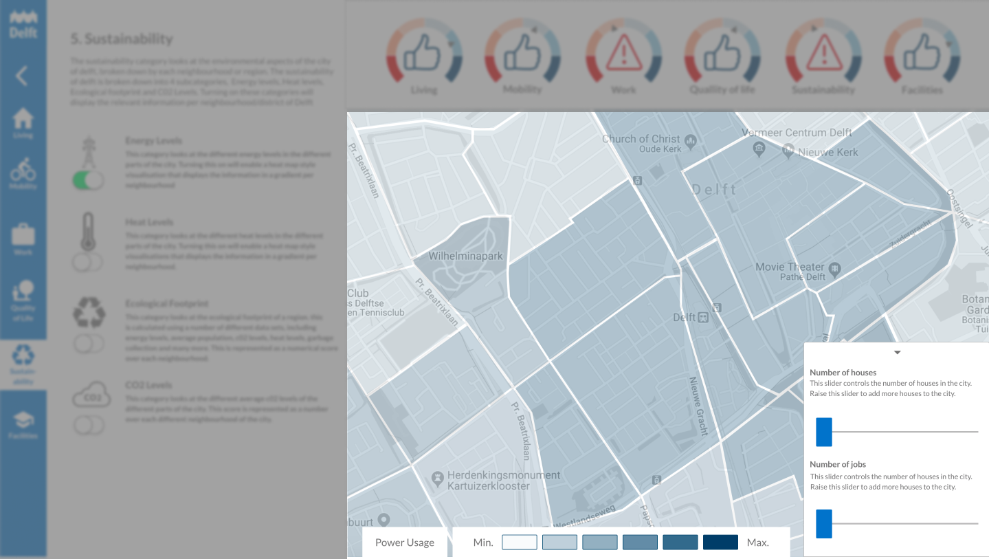
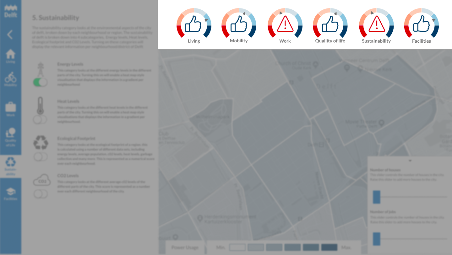
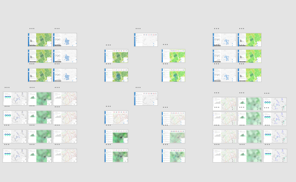
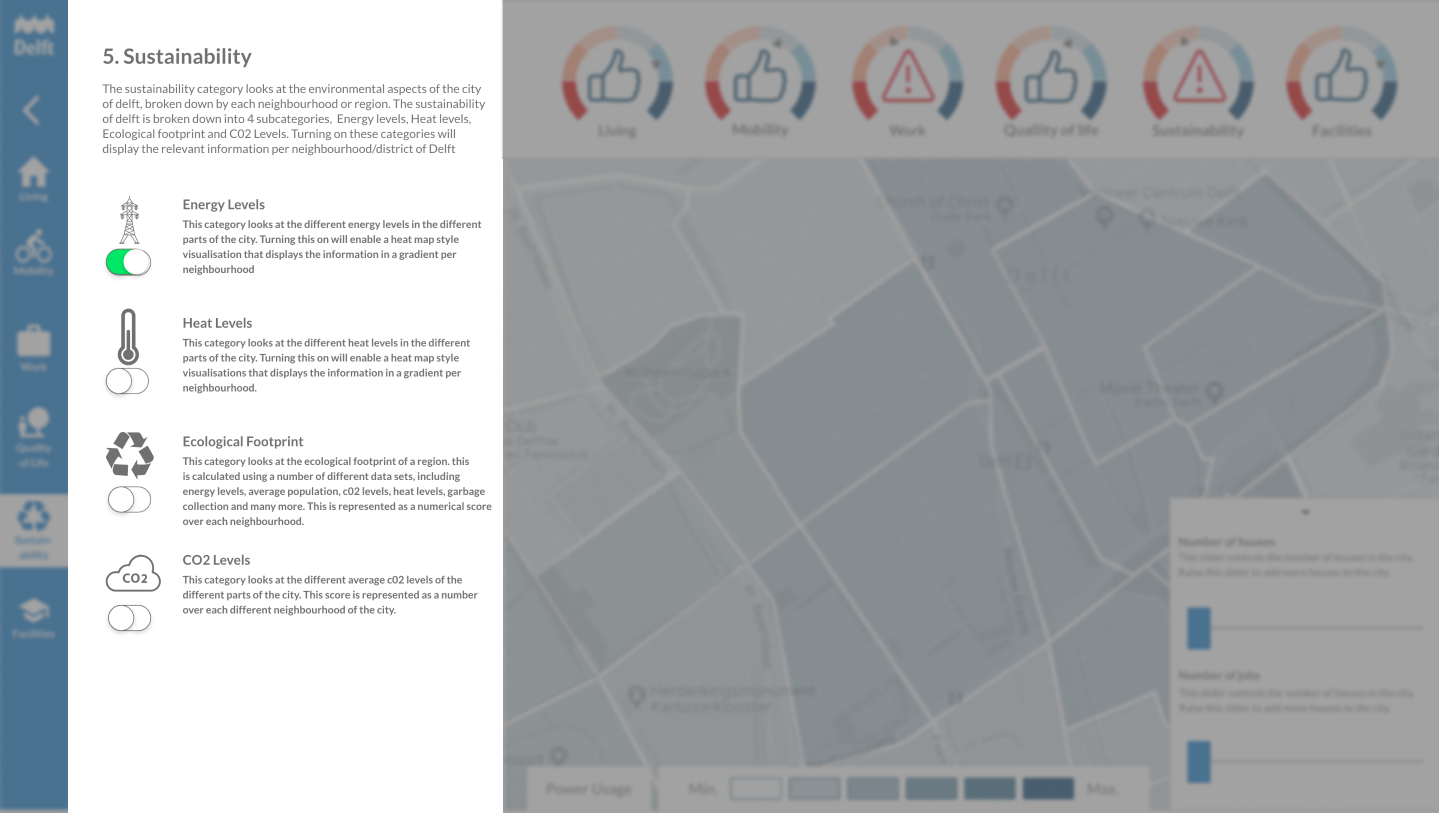
Throughout the dashboard: users can look at a whole myriad of different data visualizations: from traffic to housing: to parks and more. During testing and designing we learnt that enabling users to turn on all data visualizations over one another quickly became confusing and overwhelming. Therefore we limit the users to one active visualization category at the time (such as housing or mobility or jobs). To maintain an oversight of the overall effect we have the notifcation center at the top of the interface.


Using Color with Purpose.

In order to ensure that our users are able to understand the information intrinsically, it was important for each type of data visualization category to use consistent colors. As we learnt from our research: its better when it comes to data visualizations to use one color to represent data and the intensity of the color to represent the intensity of the data (i.e light blue to low housing density and a dark blue to represent high housing density). The exception to this is the scale from green to red which indicated a scale from optimal to non-optimal.

Notification Center.

In order to make our dashboard more effective for a wide range of audience: and because when we tested this feature with the client they responded really well to it: a core part of the Delft dashboard is the notifications center: visible at all parts of the dashboard design. When a user makes a data changes in one section they can track using this feature if it will cause problems in other sectors without overly cluttering or confusing the user. For example if a user adds homes In the homes section: the mobility indicator may jump to the red indicating that there is a problem with the mobility as a result of increasing the houses in this region.


Reactive suggestions.

The dashboard doesn't just say when there are problems expected or when something is in contradiction not a city law (i.e. minimum number of parking spaces per household). We also experimented with the idea that the dashboard could provide suggestions of where and or how certain changes needed to be made. For example if someone increases the jobs slider eventually the dashboard will suggest new places for offices or retail jobs in order to accommodate the extra jobs you are adding to the city.


Testimonial.

It is quite ambitious that we want to build 15,000 homes. Jeroen shows us very nicely with his dashboard what happens when we do certain things in the city. I thought that very was interesting, because we as a municipality need to know that in order to make responsible decisions. It was exciting to know that its possible to do it in this way. -Burgemeester Marja van Bijsterveldt (Mayor of Delft).

Conclusion.

The project was very successful. Not only were the afflicted client team members very pleased with what we managed to accomplish; during the expo, many people were able to engage interactively with the dashboard: and as a result the very quickly understand what, how and why the dashboard was doing what it was doing. Furthermore; many people who interacted with the dashboard quickly came up with use cases and examples of how it could be used to make their jobs within the municipality much easier.

Links to Outcomes

Some of the outcomes in this case study may be vague or missing to protect the client's intellectual property.